The Most Annoying UX Patterns of the Modern Web. Part 2

I recently wrote an article about the most annoying UX patterns of the modern web. This is Part 2. There are simply too many things wrong with the internet for one article to cover. Once you start noticing these patterns, they appear everywhere. Different products, different industries, same frustrations.
Consider this a continuation of a very long list of small, avoidable annoyances that quietly test your patience every day.
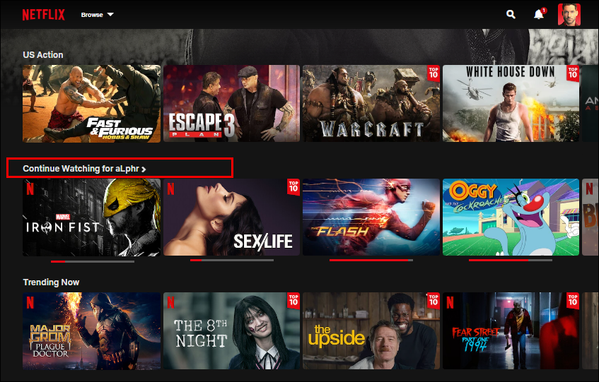
1. “Continue Watching” items caused by end credits
You finish a movie, exit during the last 5 to 10 minutes of credits, and later see it sitting in your Continue Watching list. Most people do not watch credits. Unless it is a Marvel movie and you are waiting for a post-credit scene, the experience is already over.
Streaming platforms have enough data to understand this behavior. They know where credits begin and when the narrative ends. Treating credits as required viewing turns Continue Watching into a technical artifact rather than a useful feature.
Over time, the list fills up with content you have already finished but now have to remove manually. For people who care about clean, functional lists, this is an unnecessary annoyance that should not exist in 2026.
2. Streaming TV apps missing basic functionality
Many streaming platforms offer full control on web and mobile, but remove basic features from their TV apps. A common example is the inability to remove a movie or show after you opened it and decided not to watch it.
On most TVs, there is no way to clean this up. The item stays in your list until you open the same platform on your phone or laptop and remove it there. For people who use streaming apps primarily on TV, this is frustrating. The TV is the main surface and basic list management should not require switching devices.

3. Alphabetical keyboards on TVs
While we are already talking about TV UX, typing on a TV deserves its own complaint. There is almost nothing worse than entering text with a remote. The alphabetical keyboard somehow manages to make that experience even slower.
Most people type every day using QWERTY keyboards. That muscle memory is deeply ingrained. Alphabetical layouts break it completely and force users to hunt for every letter, turning a simple search into a chore.
Typing on a TV will never be enjoyable, but choosing an alphabetical keyboard actively makes it worse. This is unnecessary friction added to an already frustrating task.

4. Full-screen location modals during search
You search for something local on Google, like a tailor or café, and before you can see the results a full-screen modal appears asking for your precise location.
Location access request itself is reasonable, but the way it is requested is not. Blocking the entire screen forces a decision at a moment when the user is trying to scan results.
Modals should be reserved for only urgent or critical actions. A banner or inline prompt at the top of the page would communicate the same thing without interrupting the flow.

5. Chatbots placed on the left side of the screen
Most people expect chat interfaces to appear on the right side of the screen. Messaging apps, support chats, and assistants have reinforced this pattern for years. Most people are right-handed, and even left-handed users have internalized this pattern through years of repetition. The right side has become the default mental model for conversational UI. When a chat opens on the right, it feels expected and easy to ignore or engage with on demand.
Putting chatbots on the left disrupts that expectation and feels distracting the moment it appears. Amazon’s AI chatbot Rufus is perfect example. Opening on the left feels awkward and unhelpful.

6. Checkout flows packed with forced add-ons
You pick a flight, confirm the details, and try to pay. Instead of finishing the purchase, you are stopped by a series of “optional” offers.
Airline websites do this constantly. Seat selection, insurance, car rental, hotel deals, priority boarding. Each appears on its own screen and requires a decision before you can move forward.
On an airline website, user’s intent is to buy a ticket. Every extra step delays that outcome and turns a straightforward task into a test of patience. Add-ons work better when they stay in the background and appear only after interaction. A simple list with expandable options would solve this. If user clicks on car rental, show the details. Otherwise, let them continue.
Airlines want to maximize revenue per customer. That goal is understandable. But it doesn’t change the fact that turning checkout into a gauntlet creates annoyance instead of value. I firmly believe that business goals do not justify deliberately irritating users. Designing friction into a critical flow feels disrespectful of users’ time and patience.
7. Push notification overload
Some apps send so many push notifications that users eventually disable them entirely in system settings. When that happens, useful messages disappear along with the noise.
I recently downloaded the Macy’s app. Within two days, I was receiving multiple notifications a day about dresses I might like, sales I did not ask for, and promotions I was not interested in. Turning notifications off was inevitable. But that also removes delivery updates and order status alerts which I do not mind receiving.
In a world already full of interruptions, multiple marketing pushes a day from the same app is excessive. Used sparingly, push notifications can be valuable. Used aggressively, they train users to block them completely.

8. Ads inside your email inbox
Email is supposed to be a utility. Open it, read messages, respond, leave. When ads start competing with actual emails reading them becomes harder than it needs to be.
My first email address was on Yahoo, and I still have access to it. Many old accounts are tied to it, so occasionally I have to log in. Every time I do, ads dominate the interface. It feels like only half of the screen is dedicated to actual email, with the rest filled by banners, promoted content, and visual noise.

9. Unskippable feature tours and walkthroughs
Feature tours, walkthroughs, and coach marks can be useful in very specific cases. New tools, complex workflows, or genuinely confusing features sometimes benefit from guidance.
The problem starts when these tours become mandatory. Unskippable slides, forced steps, and overlays you cannot dismiss until you have clicked through everything. This is especially irritating when you already know the product but opened a new account, reinstalled the app, or logged in on a new device.
People do not read instructions by default. Most users explore interfaces by doing, not by studying. Forcing them through explanations they did not ask for just creates friction.

10. No way to unsubscribe from email subscriptions at once
You enter your email somewhere once, maybe for a discount or a download, and suddenly your inbox is flooded with email subscriptions. Newsletters, promotions, and updates you do not remember signing up for. Most email clients now offer unsubscribe options, but you still have to unsubscribe from each email subscription one by one.
When dozens or hundreds of subscriptions pile up, cleaning them up becomes a repetitive task. There is no bulk unsubscribe, no reset, no fast way to reclaim your inbox (and peace). Accidental email subscriptions are very common. Getting rid of them should not feel like a project.

Bonus: App rating prompts that escalate
You download an app, barely start using it, and are immediately asked to rate it. More often than not, the prompt appears too early and interrupts the task you actually came for.
You tap a rating just to make it disappear. Instead, a second prompt appears asking you to write a review. If you accidentally agree, you are redirected to the app store or review page and pulled out of the app entirely.

None of these patterns are catastrophic on their own. They are small, familiar, and easy to dismiss. Individually, they waste seconds. Collectively, they drain attention, patience, and trust. Good UX is sometimes about removing friction that never needed to exist in the first place.
This is not the end of the list. Unfortunately.
If there is a UX pattern that ruins your mood feel free to share it with me.
The Most Annoying UX Patterns of the Modern Web. Part 2 was originally published in UX Planet on Medium, where people are continuing the conversation by highlighting and responding to this story.
المصدر: المصدر الأصلي
{“@context”:”https://schema.org”,”@type”:”NewsArticle”,”headline”:”The Most Annoying UX Patterns of the Modern Web. Part 2″,”description”:”
I recently wrote an article about the most annoying UX patterns of the modern web. This is Part 2. There are simply too many things wrong with the internet for one article to cover. Once you start noticing these patterns, they appear everywhere. Different products, different industries, same frustrations.
Consider this a continuation of a very long list of small, avoidable annoyances that quietly test your patience every day.
1. “Continue Watching” items caused by end credits
You finish a movie, exit during the last 5 to 10 minutes of credits, and later see it sitting in your Continue Watching list. Most people do not watch credits. Unless it is a Marvel movie and you are waiting for a post-credit scene, the experience is already over.
Streaming platforms have enough data to understand this behavior. They know where credits begin and when the narrative ends. Treating credits as required viewing turns Continue Watching into a technical artifact rather than a useful feature.
Over time, the list fills up with content you have already finished but now have to remove manually. For people who care about clean, functional lists, this is an unnecessary annoyance that should not exist in 2026.
2. Streaming TV apps missing basic functionality
Many streaming platforms offer full control on web and mobile, but remove basic features from their TV apps. A common example is the inability to remove a movie or show after you opened it and decided not to watch it.
On most TVs, there is no way to clean this up. The item stays in your list until you open the same platform on your phone or laptop and remove it there. For people who use streaming apps primarily on TV, this is frustrating. The TV is the main surface and basic list management should not require switching devices.
3. Alphabetical keyboards on TVs
While we are already talking about TV UX, typing on a TV deserves its own complaint. There is almost nothing worse than entering text with a remote. The alphabetical keyboard somehow manages to make that experience even slower.
Most people type every day using QWERTY keyboards. That muscle memory is deeply ingrained. Alphabetical layouts break it completely and force users to hunt for every letter, turning a simple search into a chore.
Typing on a TV will never be enjoyable, but choosing an alphabetical keyboard actively makes it worse. This is unnecessary friction added to an already frustrating task.
4. Full-screen location modals during search
You search for something local on Google, like a tailor or café, and before you can see the results a full-screen modal appears asking for your precise location.
Location access request itself is reasonable, but the way it is requested is not. Blocking the entire screen forces a decision at a moment when the user is trying to scan results.
Modals should be reserved for only urgent or critical actions. A banner or inline prompt at the top of the page would communicate the same thing without interrupting the flow.
5. Chatbots placed on the left side of the screen
Most people expect chat interfaces to appear on the right side of the screen. Messaging apps, support chats, and assistants have reinforced this pattern for years. Most people are right-handed, and even left-handed users have internalized this pattern through years of repetition. The right side has become the default mental model for conversational UI. When a chat opens on the right, it feels expected and easy to ignore or engage with on demand.
Putting chatbots on the left disrupts that expectation and feels distracting the moment it appears. Amazon’s AI chatbot Rufus is perfect example. Opening on the left feels awkward and unhelpful.
6. Checkout flows packed with forced add-ons
You pick a flight, confirm the details, and try to pay. Instead of finishing the purchase, you are stopped by a series of “optional” offers.
Airline websites do this constantly. Seat selection, insurance, car rental, hotel deals, priority boarding. Each appears on its own screen and requires a decision before you can move forward.
On an airline website, user’s intent is to buy a ticket. Every extra step delays that outcome and turns a straightforward task into a test of patience. Add-ons work better when they stay in the background and appear only after interaction. A simple list with expandable options would solve this. If user clicks on car rental, show the details. Otherwise, let them continue.
Airlines want to maximize revenue per customer. That goal is understandable. But it doesn’t change the fact that turning checkout into a gauntlet creates annoyance instead of value. I firmly believe that business goals do not justify deliberately irritating users. Designing friction into a critical flow feels disrespectful of users’ time and patience.
7. Push notification overload
Some apps send so many push notifications that users eventually disable them entirely in system settings. When that happens, useful messages disappear along with the noise.
I recently downloaded the Macy’s app. Within two days, I was receiving multiple notifications a day about dresses I might like, sales I did not ask for, and promotions I was not interested in. Turning notifications off was inevitable. But that also removes delivery updates and order status alerts which I do not mind receiving.
In a world already full of interruptions, multiple marketing pushes a day from the same app is excessive. Used sparingly, push notifications can be valuable. Used aggressively, they train users to block them completely.
8. Ads inside your email inbox
Email is supposed to be a utility. Open it, read messages, respond, leave. When ads start competing with actual emails reading them becomes harder than it needs to be.
My first email address was on Yahoo, and I still have access to it. Many old accounts are tied to it, so occasionally I have to log in. Every time I do, ads dominate the interface. It feels like only half of the screen is dedicated to actual email, with the rest filled by banners, promoted content, and visual noise.
9. Unskippable feature tours and walkthroughs
Feature tours, walkthroughs, and coach marks can be useful in very specific cases. New tools, complex workflows, or genuinely confusing features sometimes benefit from guidance.
The problem starts when these tours become mandatory. Unskippable slides, forced steps, and overlays you cannot dismiss until you have clicked through everything. This is especially irritating when you already know the product but opened a new account, reinstalled the app, or logged in on a new device.
People do not read instructions by default. Most users explore interfaces by doing, not by studying. Forcing them through explanations they did not ask for just creates friction.
10. No way to unsubscribe from email subscriptions at once
You enter your email somewhere once, maybe for a discount or a download, and suddenly your inbox is flooded with email subscriptions. Newsletters, promotions, and updates you do not remember signing up for. Most email clients now offer unsubscribe options, but you still have to unsubscribe from each email subscription one by one.
When dozens or hundreds of subscriptions pile up, cleaning them up becomes a repetitive task. There is no bulk unsubscribe, no reset, no fast way to reclaim your inbox (and peace). Accidental email subscriptions are very common. Getting rid of them should not feel like a project.
Bonus: App rating prompts that escalate
You download an app, barely start using it, and are immediately asked to rate it. More often than not, the prompt appears too early and interrupts the task you actually came for.
You tap a rating just to make it disappear. Instead, a second prompt appears asking you to write a review. If you accidentally agree, you are redirected to the app store or review page and pulled out of the app entirely.
None of these patterns are catastrophic on their own. They are small, familiar, and easy to dismiss. Individually, they waste seconds. Collectively, they drain attention, patience, and trust. Good UX is sometimes about removing friction that never needed to exist in the first place.
This is not the end of the list. Unfortunately.
If there is a UX pattern that ruins your mood feel free to share it with me.
The Most Annoying UX Patterns of the Modern Web. Part 2 was originally published in UX Planet on Medium, where people are continuing the conversation by highlighting and responding to this story.
“,”datePublished”:”2026-01-24 18:33:26″,”author”:{“@type”:”Organization”,”name”:”العربية”},”publisher”:{“@type”:”Organization”,”name”:”Newsly”,”url”:”https://wordpress-hr2d6.wasmer.app”},”image”:”https://cdn-images-1.medium.com/max/847/0*RjMbsgipbAJeuGjJ.png”}
Post Comment